Designing a Poke-Inducing Creature
- Keana Almario

- Nov 9, 2018
- 3 min read
Updated: Apr 2, 2019

For the past month, we were met with “I… still don’t know what your game is” comments. And at that time, we were still looking at each individual interaction we wanted to explore. Those comments stop today*, because we’ve finally decided on our game!
This week, we also took a step back from designing the mechanics around the theme of the game. Through our mentors’ advice and external playtesting, we learned to put our intended player actions and user experience first, before thinking about any visual concepts — such as character art.
*by today, I mean last week.
Deciding on the ‘game’ – finally!
You, the player wearing the Mixed Reality headset, can see floating creatures around you. Using the Leap Motion camera attached, you can poke, pick up, and throw these creatures — all with your bare hands!
Currently, our project is less of a game and more of an interactive sandbox experience. We really want to get that player-creature interaction right first before gamifying it, because we believe that the UX of unique tech like this should be the main focus of the project.
Realizing people don’t play with fire

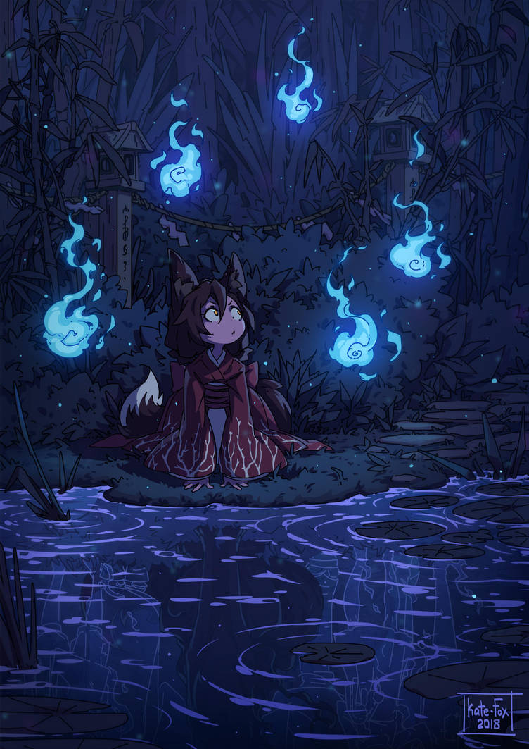
At first, we were thinking of will-o’-the-wisps. These creatures had the perfect magical feeling we wanted to convey. We wanted to focus on blobs of fire. We also wanted there to be a consistent base body, with a fire shader around it that would vary in size, shape, and proportion.

We then realized (thanks to our art mentor) that the problem with will-o’-the-wisps lay in the very core of their design: they were little balls of fire. The first instinct of most people is not to play with fire. Using the ghostly, fiery likeness of will-o’-wisps would go directly against the core of what we hoped the players would do: poke it.
“Ok time for me to bother this animal”
Since our focus was on player interaction, we wanted to zone in on the interface between the player and the creature: we wanted to think about that moment the player’s finger ‘touches’ the virtual creature, and the feedback from it. Instead of focusing on the magical aesthetic of the game, we decided to focus on the feel first.
The questions we asked ourselves the most during this phase were:
What feels good to poke/squish?
When do people have a difficult time resisting the urge to poke/squish?
What would that look like?
For reference, we used this very handy image:

Sure, the picture doesn’t accurately answer our questions in context of the game. We didn’t want floating animals, and we didn’t want to have any fur to render in a Mixed Reality headset. We still learned some interesting things from this picture alone (and further research):
Soft and reactive things feel good to poke/squish. Textures include fur and solid jelly-like objects (like stress balls).
People have a difficult time resisting the urge to poke/squish round and soft objects. This would include cats and fat cheeks.
This would look like… really cute jelly balls with faces. Or the dumpling kid from Pixar’s short film Bao.
Sketches, Silhouettes, and Mockup
From our research, I decided to try out some sort of jelly ghost blob:
Jelly to account for the expectation that it’ll bounce when you poke it (good feedback!)
Ghost to justify the creature floating around you
Blob to facilitate the urge to poke (round and soft characteristics).
We compiled a variety of different silhouettes and showed them to different students all over Sheridan College's Trafalgar Campus:

We found that people liked silhouettes with pet-like features (chick, cat) because of previous associations with cute animals. They also liked the silhouettes with smaller blobs floating behind them, because of the sense of movement.
I also made a mockup, playing with the color and opacity of one the designs:

Going forward…
We’re currently pretty happy the track we’re on. The creature design isn’t perfect yet, but we want to spend the next week iterating and testing on it. Our mentor pointed out that the shape and opacity of the creature looked like it was goopy instead of bouncy, so we want to iterate a less runny-looking material. We’re also planning to play with the opacity of the creature, making it look more solid+bouncy than runny/gooey.


Comments